Themes
Customize Yasumu's appearance with built-in color themes or contribute your own.
Themes
Yasumu ships with a variety of built-in color themes to personalize your development environment. Whether you prefer a dark, light, or vibrant aesthetic, there's a theme for you.
Changing the Theme
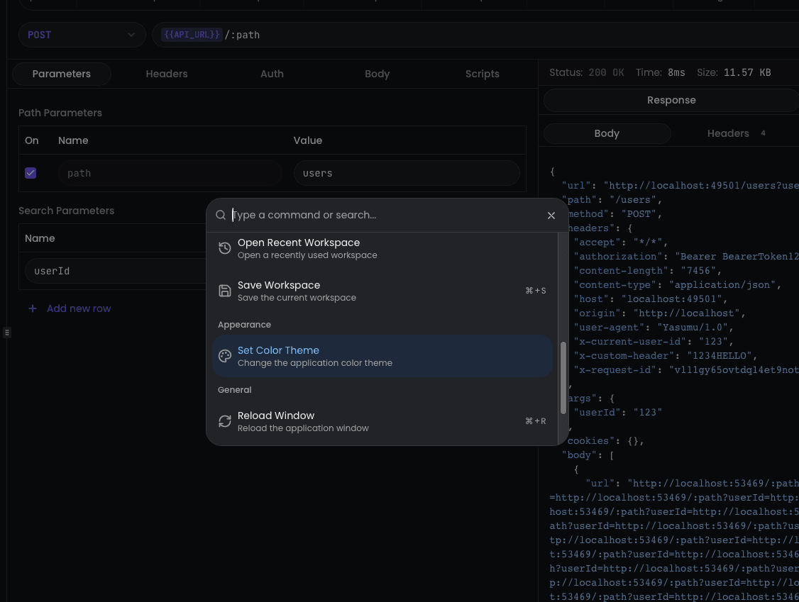
- Press ⌘ + K (macOS) or Ctrl + K (Windows/Linux) to open the command palette.
- Search for "Set Color Theme" and select it.

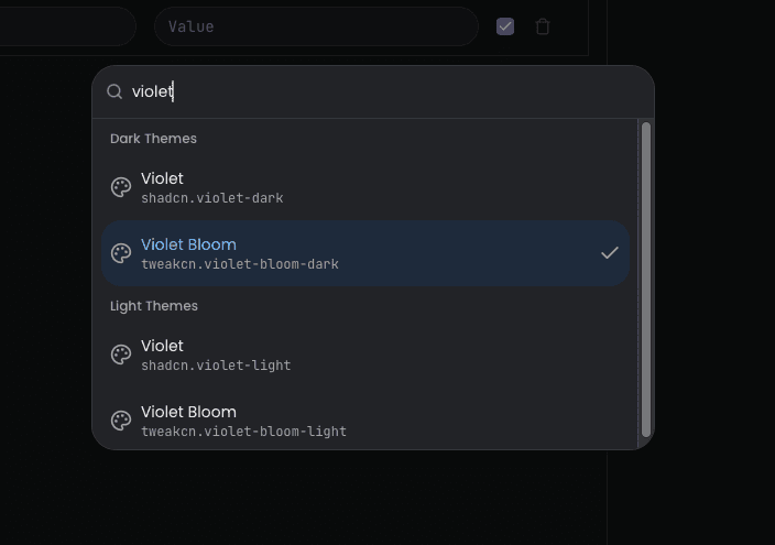
- Browse through the available themes and select one to apply it instantly.

Available Themes
Yasumu includes themes from both shadcn and tweakcn collections. Each theme comes in both light and dark variants.
shadcn Themes
| Theme | ID |
|---|---|
| Default | shadcn.default |
| Blue | shadcn.blue |
| Green | shadcn.green |
| Orange | shadcn.orange |
| Red | shadcn.red |
| Rose | shadcn.rose |
| Violet | shadcn.violet |
| Yellow | shadcn.yellow |
tweakcn Themes
| Theme | ID |
|---|---|
| Amethyst Haze | tweakcn.amethyst-haze |
| Claude | tweakcn.claude |
| Cosmic Night | tweakcn.cosmic-night |
| Mono | tweakcn.mono |
| Pastel Dreams | tweakcn.pastel-dreams |
| Perpetuity | tweakcn.perpetuity |
| T3 Chat | tweakcn.t3-chat |
| Tangerine | tweakcn.tangerine |
| Vercel | tweakcn.vercel |
| Violet Bloom | tweakcn.violet-bloom |
Contributing Themes
Want to add your own theme to Yasumu? We welcome contributions!
Prerequisites
- A shadcn/ui compatible CSS theme file
- Basic knowledge of CSS variables
Theme Structure
Yasumu themes are CSS files that define color variables for both
:root (light mode) and .dark (dark mode) selectors. The theme
converter automatically generates both light and dark variants from a
single CSS file.
Steps to Contribute
-
Fork the repository and clone it locally.
-
Create your theme CSS file in the
themes/presets/directory. Use the naming convention:
author.theme-name.cssFor example: johndoe.midnight-blue.css
- Define your theme variables following this structure:
:root {
  --background: 0 0% 100%;
  --foreground: 222.2 84% 4.9%;
  --card: 0 0% 100%;
  --card-foreground: 222.2 84% 4.9%;
  --popover: 0 0% 100%;
  --popover-foreground: 222.2 84% 4.9%;
  --primary: 222.2 47.4% 11.2%;
  --primary-foreground: 210 40% 98%;
  --secondary: 210 40% 96.1%;
  --secondary-foreground: 222.2 47.4% 11.2%;
  --muted: 210 40% 96.1%;
  --muted-foreground: 215.4 16.3% 46.9%;
  --accent: 210 40% 96.1%;
  --accent-foreground: 222.2 47.4% 11.2%;
  --destructive: 0 84.2% 60.2%;
  --destructive-foreground: 210 40% 98%;
  --border: 214.3 31.8% 91.4%;
  --input: 214.3 31.8% 91.4%;
  --ring: 222.2 84% 4.9%;
  --radius: 0.5rem;
  --chart-1: 12 76% 61%;
  --chart-2: 173 58% 39%;
  --chart-3: 197 37% 24%;
  --chart-4: 43 74% 66%;
  --chart-5: 27 87% 67%;
}

.dark {
  --background: 222.2 84% 4.9%;
  --foreground: 210 40% 98%;
  --card: 222.2 84% 4.9%;
  --card-foreground: 210 40% 98%;
  --popover: 222.2 84% 4.9%;
  --popover-foreground: 210 40% 98%;
  --primary: 210 40% 98%;
  --primary-foreground: 222.2 47.4% 11.2%;
  --secondary: 217.2 32.6% 17.5%;
  --secondary-foreground: 210 40% 98%;
  --muted: 217.2 32.6% 17.5%;
  --muted-foreground: 215 20.2% 65.1%;
  --accent: 217.2 32.6% 17.5%;
  --accent-foreground: 210 40% 98%;
  --destructive: 0 62.8% 30.6%;
  --destructive-foreground: 210 40% 98%;
  --border: 217.2 32.6% 17.5%;
  --input: 217.2 32.6% 17.5%;
  --ring: 212.7 26.8% 83.9%;
  --chart-1: 220 70% 50%;
  --chart-2: 160 60% 45%;
  --chart-3: 30 80% 55%;
  --chart-4: 280 65% 60%;
  --chart-5: 340 75% 55%;
}- Generate the theme by running the converter from the root of the repository:
pnpm generate-themes --compactThis will update apps/yasumu/src/lib/constants/builtin-themes.ts
with your new theme.
-
Test your theme by running Yasumu locally and selecting your theme from the command palette.
-
Submit a Pull Request with your changes to the
themes/presets/directory.
Converter Modes
The theme converter supports two modes:
| Mode | Command | Output |
|---|---|---|
| Compact | pnpm generate-themes --compact | Single TypeScript file with all themes (used in production) |
| Expanded | pnpm generate-themes | Individual JSON files per theme in themes/output/ |
Theme Naming
The theme name displayed in Yasumu is derived from the filename:
author.theme-name.css→ Theme Name- The author prefix is stripped, dashes become spaces, and words are capitalized.
For example:
shadcn.violet.css→ Violettweakcn.cosmic-night.css→ Cosmic Night
